CAISO Spring 2020-2026
The Duck Curve Is Changing
California's spring grid used to be defined by solar pushing net load sharply lower at midday. In 2026, the more important story is what happens next: batteries are turning that midday surplus into evening supply.
How Has the Fuel Mix Changed?
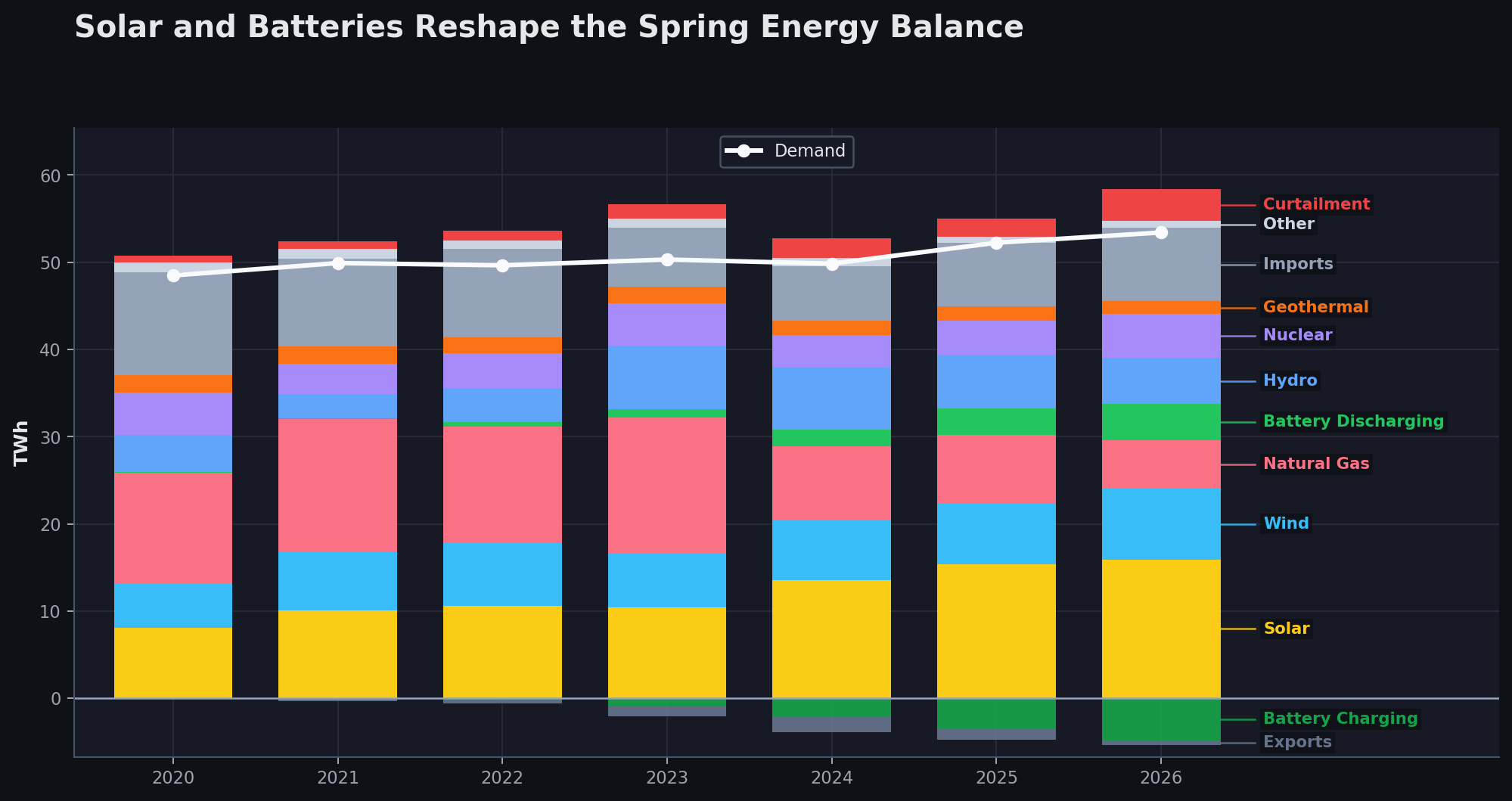
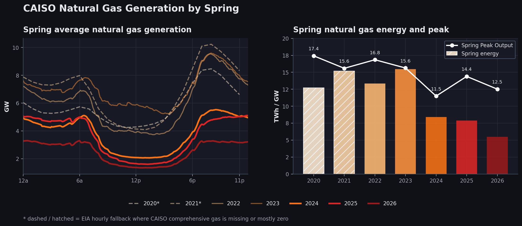
The fuel mix shows the system-wide reshuffling. Solar, even with its low capacity factor, is now the single largest energy supplier. Starting in 2024, natural gas generation plummeted, and 2026 saw the lowest natural gas share of total energy supplied in the dataset. While lower natural gas generation in 2024 was partly due to reduced demand, total demand in 2026 is higher than ever, and natural gas generation is still at its lowest. This is driven largely by wind generation and imports, mostly clean hydro imports from the Northwest. Batteries have moved from a rounding error to a visible operating resource, and natural gas is increasingly pushed toward minimum operation. In fact, there were six days in May 2026 when average natural gas generation was below 1 GW for the first time, something we had not witnessed in prior years.
Solar Expansion Has Been Incremental
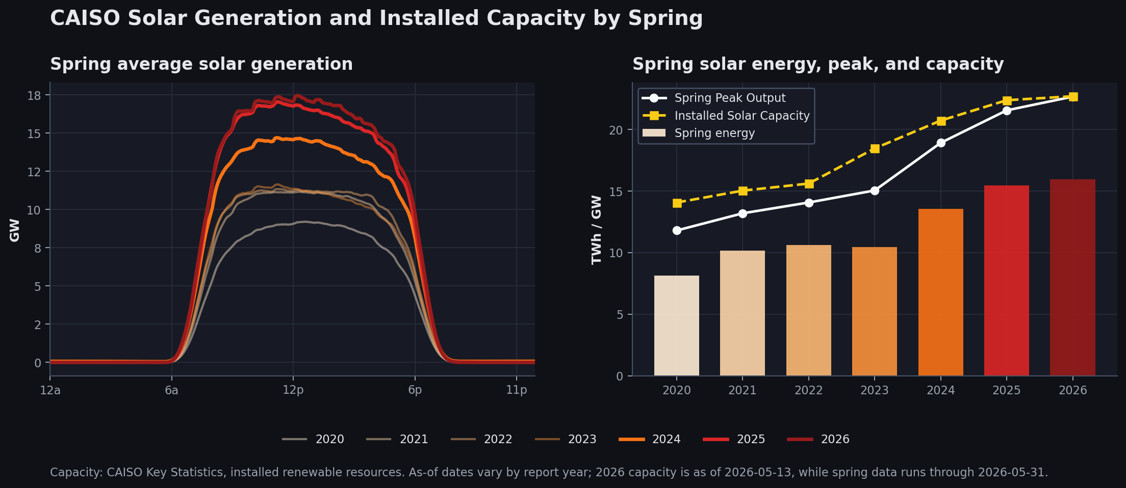
Spring is where California's solar buildout is easiest to see. Load is moderate, sunshine is strong, and solar output regularly reaches levels that would have looked extreme only a few years ago.
The important detail is that peak solar output is no longer the whole story. Installed capacity, curtailment, prices, and battery charging all determine how much of that solar can be used in the hour it is produced.
Looking at the two charts below, California saw a steep increase in solar capacity starting in 2023, which lifted generation in the years that followed. Incremental solar expansion is lower now, which is reflected in total midday generation in spring 2025, barely higher than the prior year.
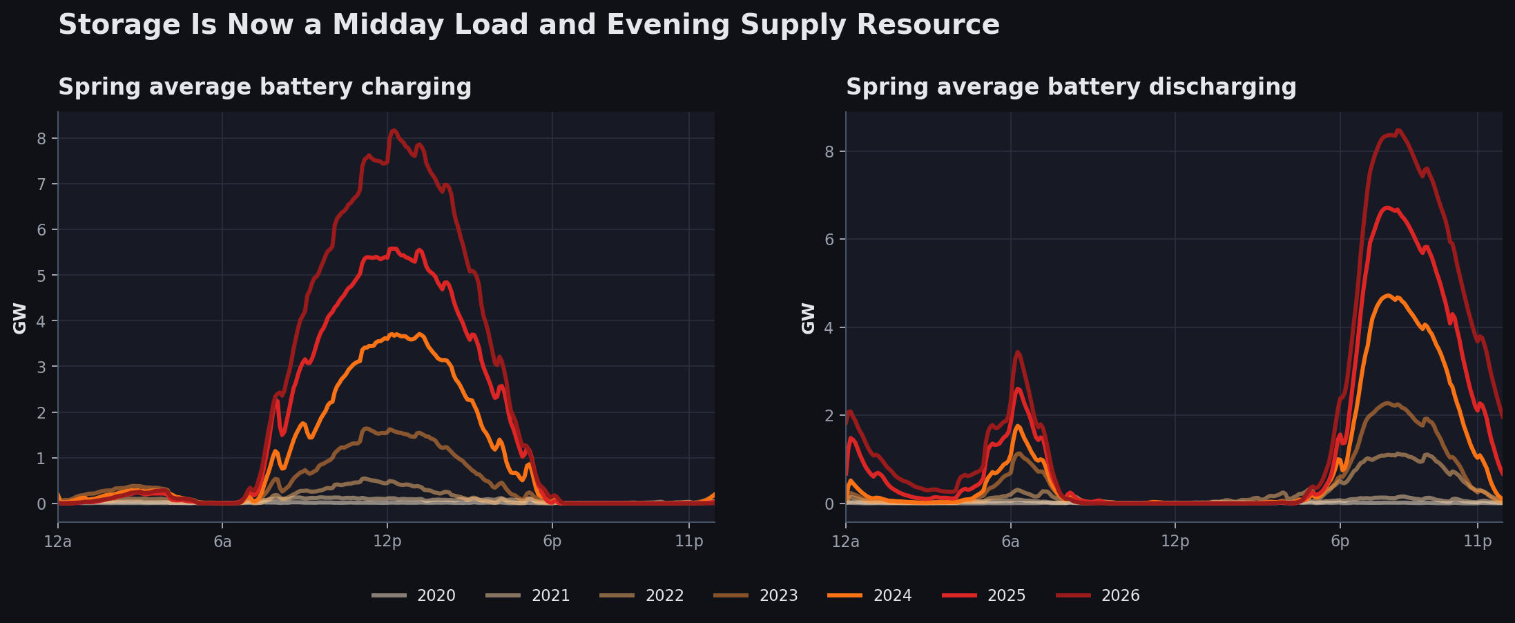
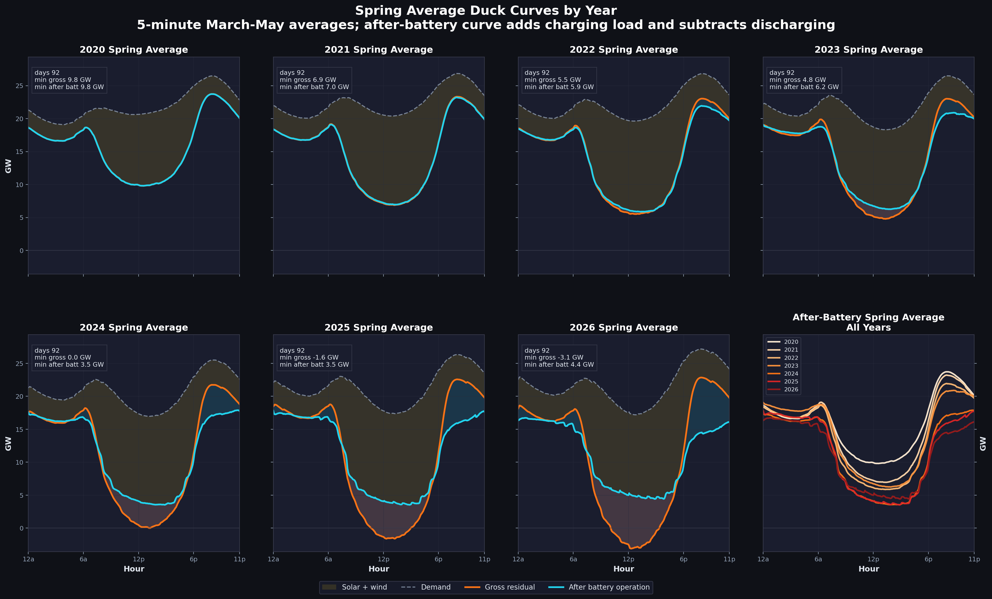
Storage Became a Daily Grid Actor
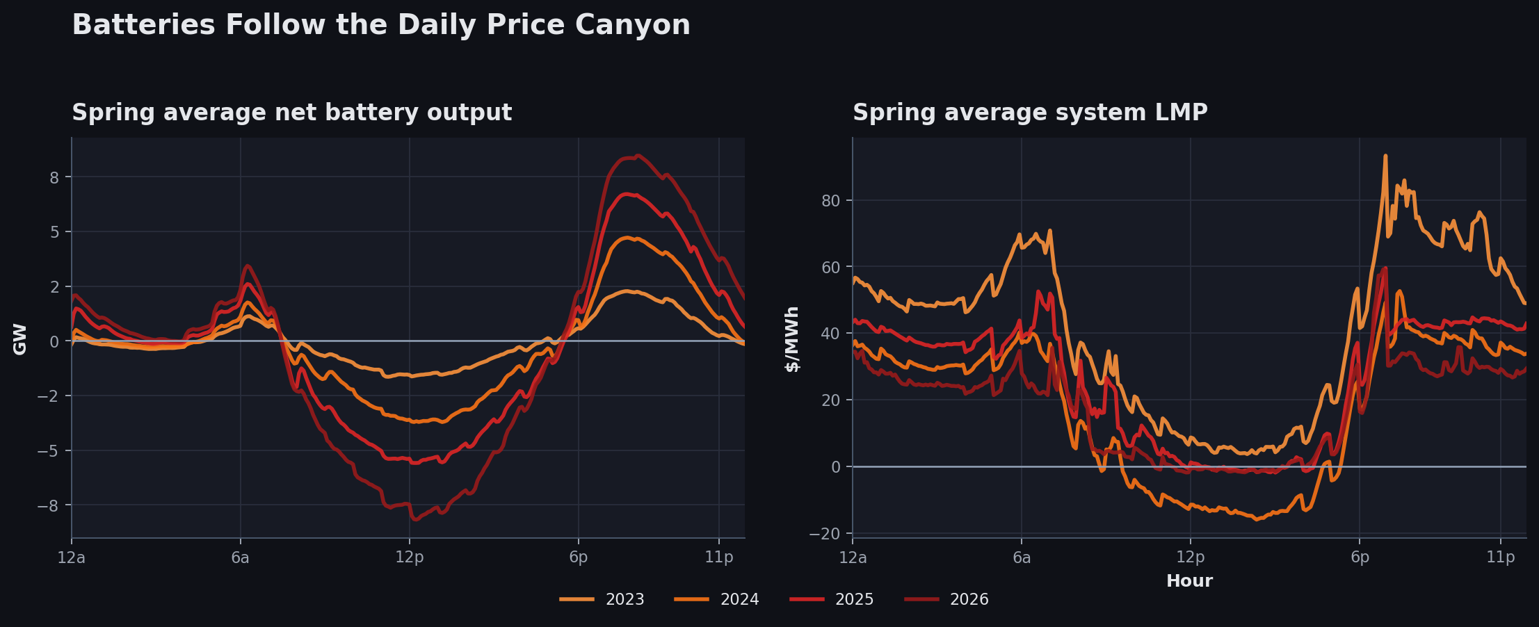
The battery chart is the hinge of the story. Early in the period, storage barely changes the system shape. By 2025 and 2026, batteries charge heavily during solar hours and discharge into the evening ramp. Unlike solar capacity additions, batteries continue on an exponential growth trajectory and are starting to drive the daily load curves.
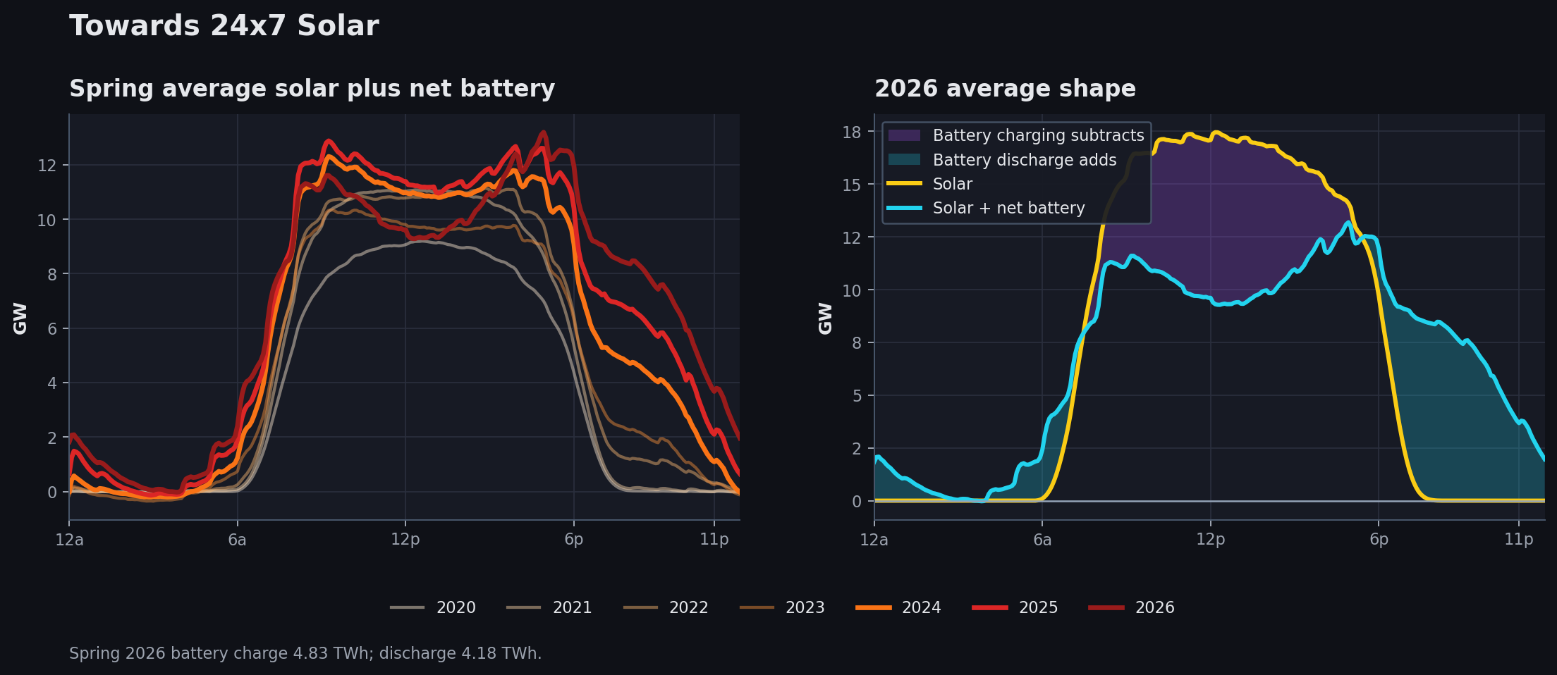
Towards 24x7 Solar
Solar plus battery output reframes the duck curve. Charging makes solar look smaller in the middle of the day, but the stored energy reappears in the evening, when the grid used to lean much harder on gas. This displaces polluting resources, especially peaker gas plants, by reducing ramping requirements and even some CCGT needs. The result is a deviation from the typical parabolic solar shape, extending solar's impact into non-solar hours. However, as batteries march forward, they also leave some gaps that are not currently tackled. More on that later.
The Duck Is Not Ducking Anymore
Gross load has not transformed as dramatically as net load. In Panel 1 of the chart below, midday load is starting to show the impact of added battery capacity. Net load, after subtracting solar and wind from load, is starting to plateau year over year, with very similar values over the last three years. Even after the increase in solar capacity from 2024 to 2025, rising battery charging during midday hours means the duck is not sitting any lower than it was a couple of years ago. The third view is where the evening system starts to look materially different, driving down both morning and evening net loads. The duck is not looking down anymore; instead, it seems to be looking up toward a cleaner future.
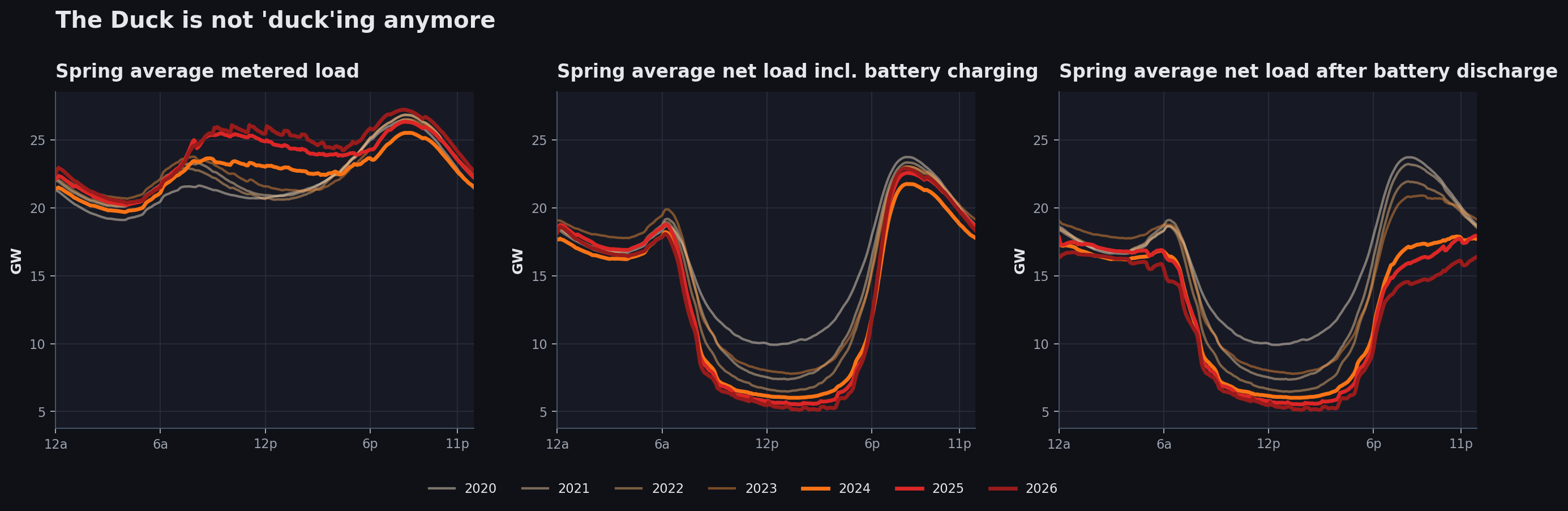
The shift is more apparent in the chart below, which shows the push and pull on the demand curve created by batteries over the last few years. Keep in mind that demand itself is going to fall during midday because of rooftop solar generation. After-battery net load is flatter during peak solar periods and lower during morning and evening peak periods. Solar deepens the midday belly, while storage changes the shoulders: charging absorbs energy when net load is low, then discharge softens the steep evening climb.
Curtailment and Negative Prices
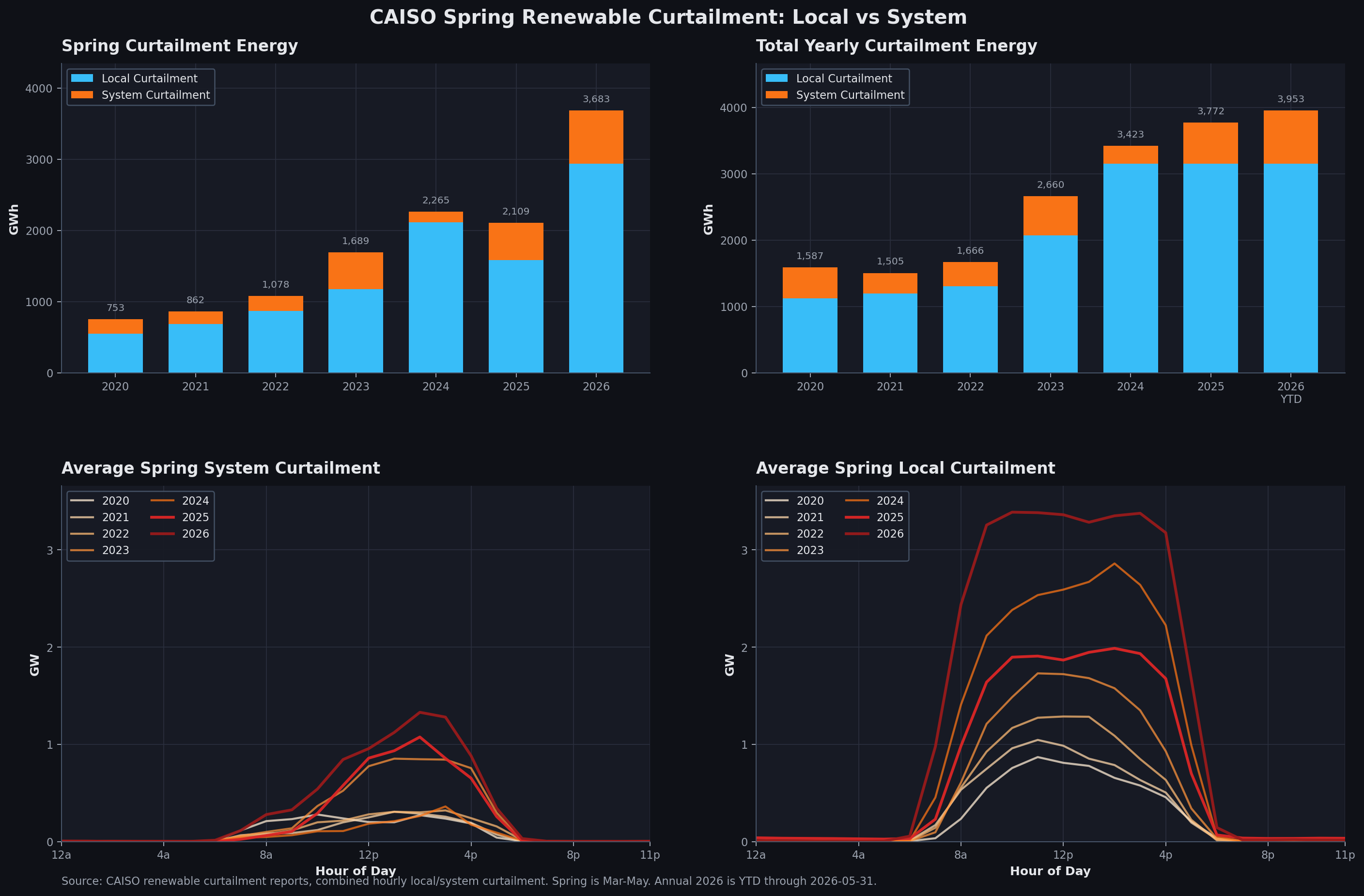
Curtailment is the first sign that midday clean generation is outrunning the grid's ability to absorb it in real time. Spring curtailment has continued to rise, with 2026 standing out as the highest spring curtailment year in this period. Most of that curtailment is local, not system-wide, which matters because it points to deliverability and congestion limits rather than simply "too much energy everywhere."
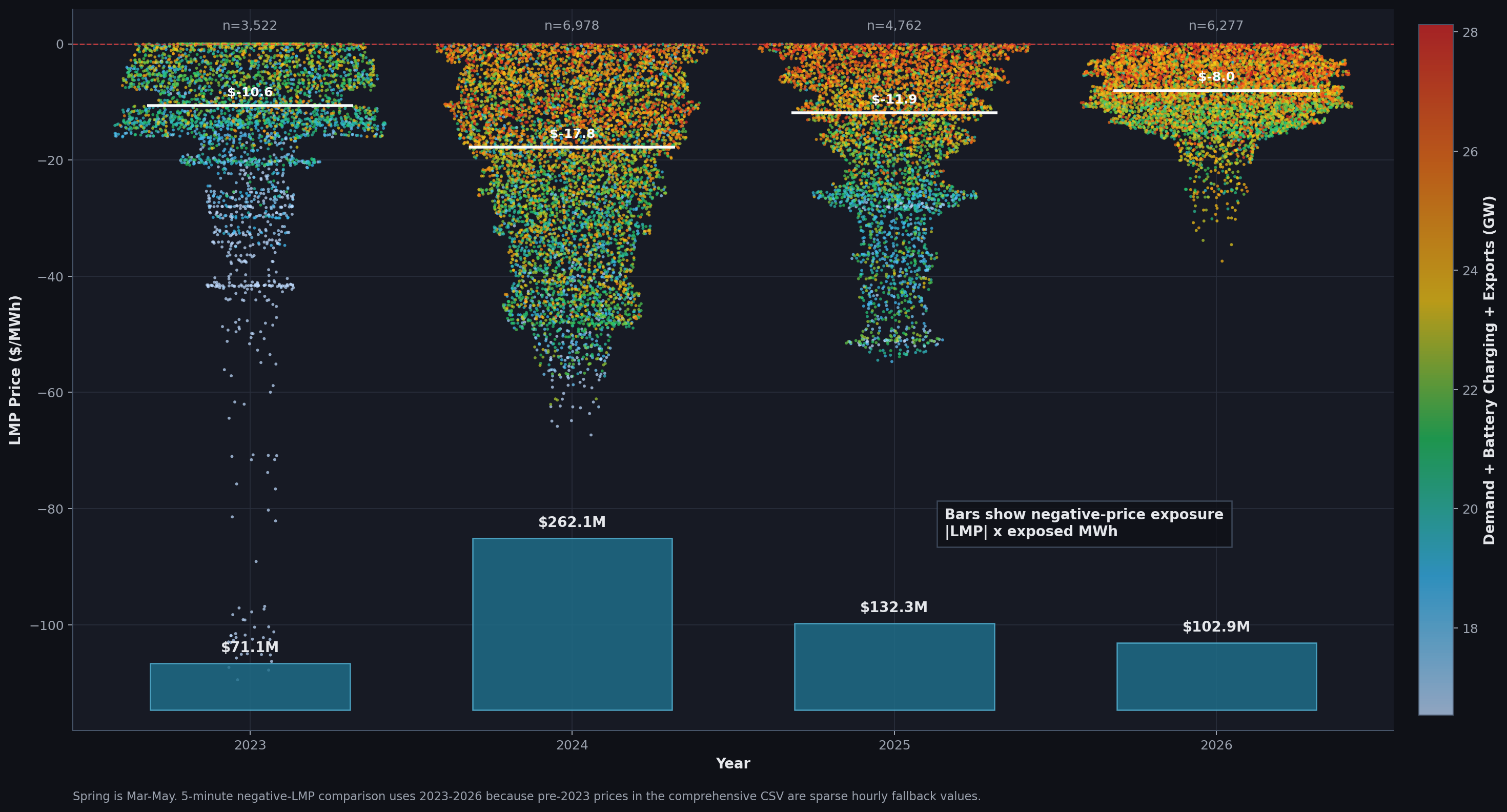
The negative-price chart shows the market impact of that oversupply. The number of 5-minute negative-LMP intervals increased in 2026, with 6,277 spring intervals compared with 4,762 in 2025. But the severity of negative prices has compressed. The central negative price moved from -$17.8/MWh in 2024 and -$11.9/MWh in 2025 to only -$8.0/MWh in 2026.
To understand market severity, we need to look beyond interval counts. The economic footprint depends on how negative the price was and how much load was exposed to it: negative-price exposure = |LMP| x exposed MWh. A single interval at a deeply negative price with a large exposed volume matters more than many shallow negative-price intervals. On that basis, 2024 remains the most severe spring in this chart at $262.1M of exposure, compared with $132.3M in 2025 and $102.9M in 2026.
Prices and Battery Cycling Are Intertwined
Batteries are extremely well suited for ancillary services because of their millisecond ramping capabilities. After flooding the ancillary service market and contributing to a precipitous decline in those market prices, batteries are now leaning more heavily on energy arbitrage, buying low and selling high during the day. It is no surprise that the lowest prices, usually during solar hours, coincide with periods of battery charging. On the discharge side, arbitrage pushes batteries to discharge during periods of the highest LMP, which used to be mostly in the evening and is now increasingly in the morning, a phenomenon discussed later. However, when batteries capture high prices, they also leave less revenue for the next battery. This is battery cannibalization: each additional battery added to the grid gets paid less, weakening the prospects for more batteries on the grid. Similarly, the more batteries charge during solar hours, the less frequently we see deeply negative prices that increase arbitrage revenue. We are already seeing both phenomena play out in the market. Evening battery discharge also reduces the need for peaker plants during evening ramps. Those plants are among the costliest and most polluting resources, so this further reduces evening LMPs.
Natural Gas Is Being Compressed
As solar and batteries take over more spring hours, natural gas generation falls most visibly in the middle of the day. Gas has not disappeared, but its spring role is increasingly concentrated around lower-renewable and ramping periods. The key change in natural gas dispatch is in non-solar hours, due to a combination of increased battery capacity, wind generation, and imports from the Northwest. This year has seen the lowest natural gas generation ever.
The Market Stress Has Moved
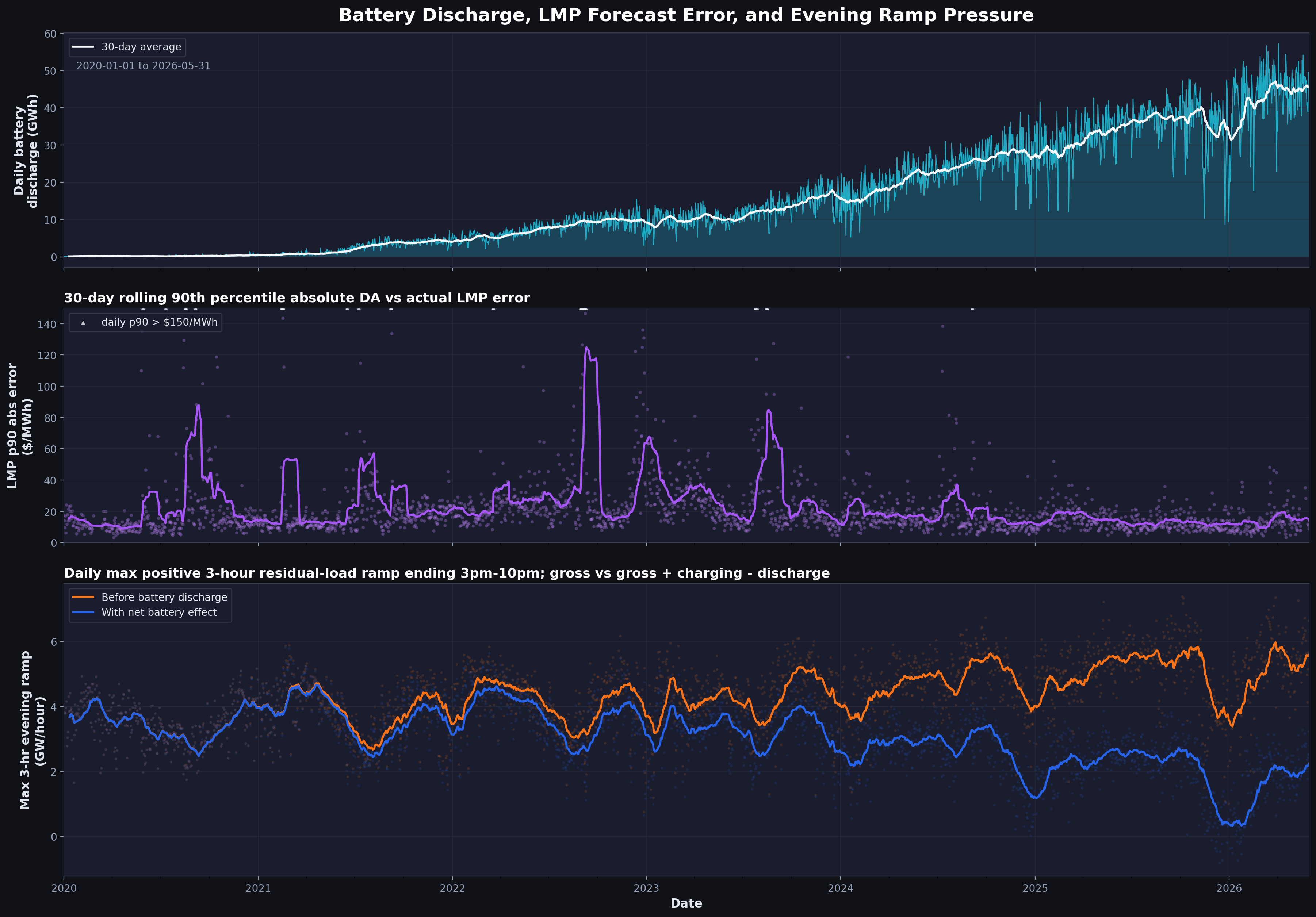
The operational challenge is no longer just "too much solar at noon." It is also the timing of ramps, the timing of peak LMPs, and the forecast errors during sharp transitions.
Check out the three-panel chart below. As battery dispatch has increased (Panel 1), we are observing two more phenomena: day-ahead and real-time prices are closer than ever (Panel 2), and the ramping requirement is lower than it has ever been (Panel 3). The reduction in ramping requirements is a direct result of the increased flexibility provided by battery storage. It has a positive impact on both climate, by avoiding inefficient peaker plants, and energy prices, since peaker plants tend to have higher heat rates and increase total energy costs. More discussion on daily error later.
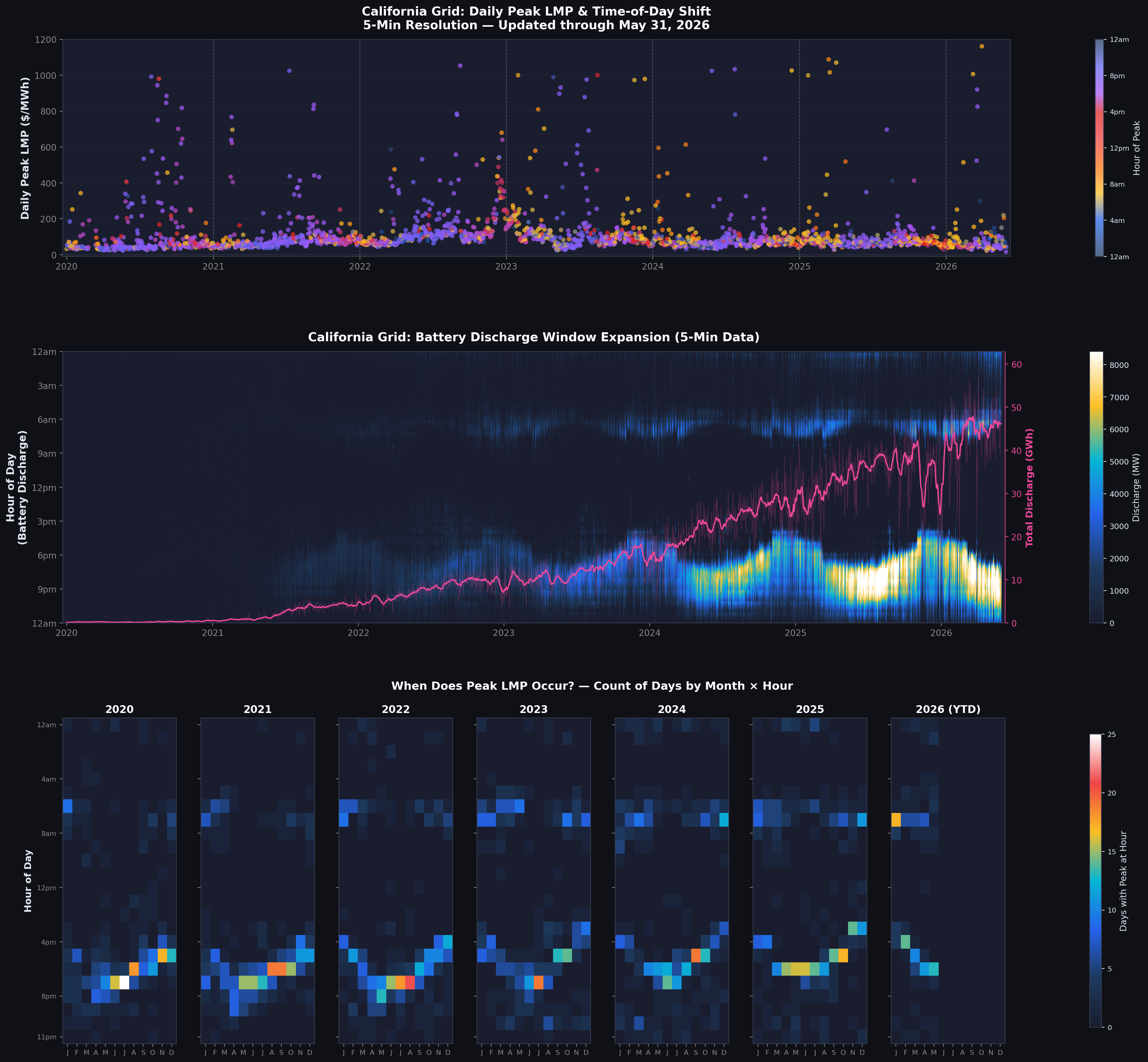
Evening May Not Be the Peak Period in the Future
As storage absorbs midday energy and releases it into the evening, the timing of the highest-price hour becomes as important as the height of the price itself. Refer to the three-panel chart below. In Panel 1, daily peak LMPs are colored by the time of day when the peak price occurred. Purple represents the usual evening hours, when we expect peaks to occur. However, there is a seasonal trend showing peak prices occurring in morning hours, shown by the yellow data points, during winter. The months in which this phenomenon occurs, with peak hours in the morning rather than the evening, are expanding. Morning peak LMPs in winter are understandable: cold mornings bring high heating load. What we are seeing now is that because batteries are able to tame evening prices, more peak prices are appearing in the morning. Panel 2 shows battery discharge, including significant discharge during morning hours in those specific months. Batteries are already capturing this arbitrage opportunity and working to flatten prices. The data points in Panel 1 are too dense to support a clear conclusion on their own, so Panel 3 presents a heatmap of when the peak price occurred. Earlier, from 2020 through 2022, peak hours occurred mostly in the evening. The yellow data points in Panel 1 were exceptions, not the norm. From 2023 onward, however, morning peaks are becoming significant. January 2026 was the first time a morning hour, 8 AM, had peak prices more often than any other hour of the day. Evening peaks are still the majority, but they are getting diffused across the entire day. As batteries compress evening LMPs and lack the same solar-charging arbitrage during morning peaks, we may see more of this shift. Morning peaks may eventually become the peak hours to care about, until longer-duration batteries come to the rescue.
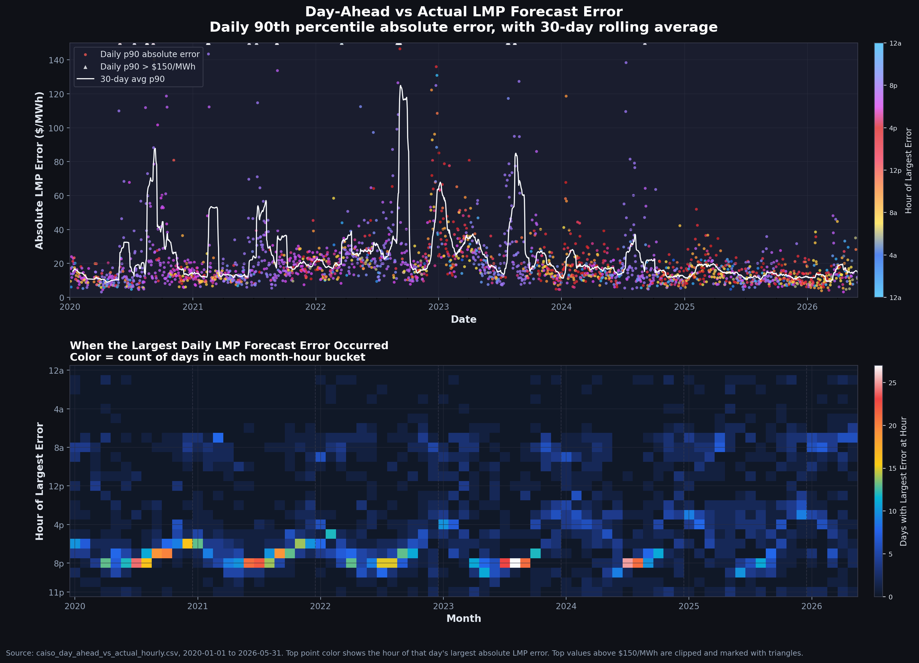
Forecast Errors Are Diminishing and Moving
The two-panel chart below illustrates the shrinking difference between day-ahead and real-time prices, as well as the shifting pattern of those differences over time. Panel 1 shows the largest daily difference between day-ahead and real-time prices, measured using the p90 error, colored by the hour in which it occurs. Panel 1 suggests that we are doing extremely well relative to any other time in the past. I believe that with more batteries in the system, sudden price spikes are more controlled during the hours when day-ahead and real-time prices deviate the most. Batteries help keep prices from straying too far from the forecast by evening out spikes in the real-time market. Panel 2 shows when the maximum error occurs. In the initial years, from 2020 through 2023, peak error occurred regularly in the evening, mostly from ramp requirements and imbalances arising from steep demand increases. Lately, the peak error period has become much more diffuse, suggesting there is no dominant period when forecasts fail to match real-time prices. I do see some concentration starting to emerge in morning hours as well. In fact, May 24 and May 25, 2026 provide a good example of why we may see more such deviations during daytime.
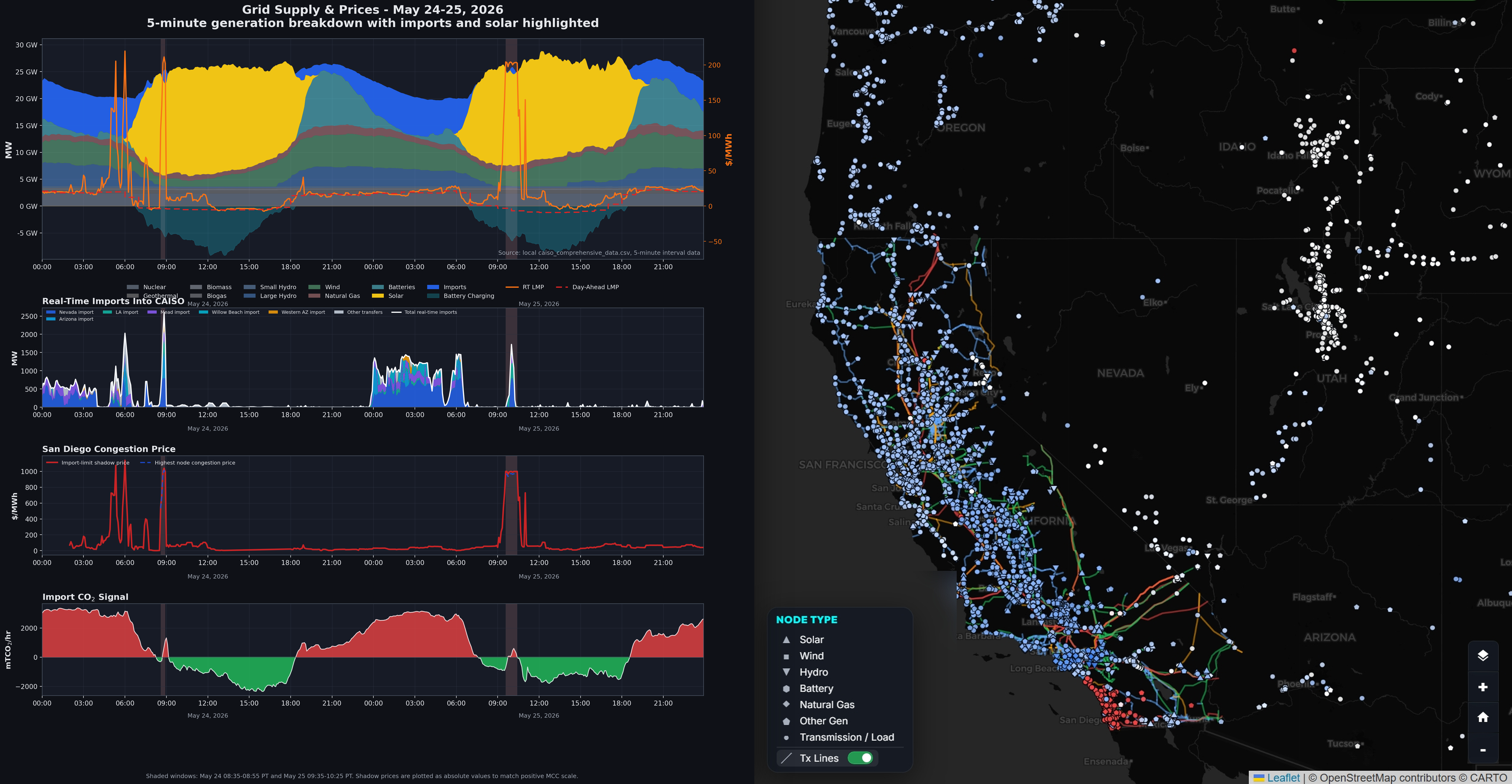
May 24 and May 25, 2026 provide a good example of why we may see more such deviations during daytime. On May 24, and then again on May 25, I observed a sudden daytime price spike that initially looked like an anomaly. I investigated further. The chart below is my explanation of what happened and what it shows about grid operations. There is a lot here, so let's go slowly. First, we observed spiky daytime prices. When I looked at the price components, the spike was almost entirely from congestion, which was not surprising. The map at the bottom shows that the San Diego region had extreme congestion prices during that period. Looking at the generation mix during those troubled intervals helps pinpoint what happened. Solar generation dropped suddenly, likely because some large farms turned off, and that solar had been supplying electricity to the San Diego region. Batteries kept charging, so they did not fill the gap created by solar being offline. The demand gap was then filled by imports coming from the Southeast, which is why emissions also spiked during that period. Panel 2 shows imports coming from the Southwest, Nevada, and Arizona. When the import stack spikes around the shaded window, it means imports were actively moving through those paths. If the system depends on those imports and then a constraint binds, prices can jump because the market has to replace that supply with more expensive local generation or congestion-priced energy. Panel 3 shows the San Diego congestion price. The red line shows the import-limit shadow price. A shadow price means: how expensive is this constraint right now? If the red line jumps, the import limit is binding and valuable. The blue dashed line corresponds to the highest nodal congestion price, suggesting that the import constraint into San Diego was binding. Basically, because solar was not generating in that moment, one region had to import electricity, which pushed congestion prices up. Interestingly, both events happened during daytime. I believe that in periods when batteries are not charged, or cannot supply to the node, we need clean firm resources. While this was a one-off, or rather two-off, event, I expect that we will need clean dispatchable resources available during morning periods for reliability needs. That need will only increase as we add more variable energy resources to the grid, unless longer-duration storage fills this gap.
What changed: the duck curve was once mostly a net-load shape. It is now a storage, price, and ramp story.
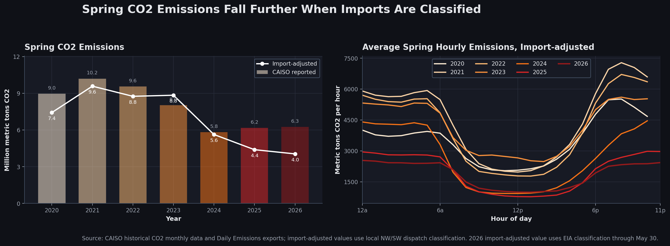
The Emissions Signal Is Now a Spring Story Too
CO2 emissions follow the same operating logic. As gas is displaced in more spring hours, total spring emissions have fallen sharply from the early 2020s. Treating 2020 as a COVID anomaly, emissions have decreased year over year since then. The hourly curve also shows how emissions are increasingly carved out during solar-heavy daytime periods.
CAISO attributes import emissions as natural gas emissions. I broke down emissions into Northwest and Southeast imports, then into various resources in each importing region using EIA interchange data and regional import mixes. Using an hourly dispatch model, one can calculate actual emissions without the flawed assumptions embedded in generic import emissions. This matters when imports are a significant fraction of the generation mix. The recalculated emissions suggest that 2026 has been the cleanest year on record. Panel 2 shows that most of this improvement comes from reductions during non-solar hours, owing to imports, wind, and battery discharge.